Microaggression is a new term for me since I am only used to words like racism and stereotypes for individuals that tend to insult or criticize another race. I never thought that common everyday conversations could be interpreted as microagressions. The earliest form of microaggression that I remembered was in first grade when I was in Virginia. I only remembered being one of the only Asian kid at my school, and one day during lunch, a kid asked me if I was Jackie Chan. At the time, I didn't know who Jackie Chan was and got confused when the kid asked me that question. The named continued to stick with me through elementary school when I finally learned who Jackie Chan was. This made me realized that kids were joking around since I was Asian and named Jacky. However, this could've also meant that all Asians can be called Jackie Chan. As a kid, people often asked me if I could speak Chinese and often asked if I could teach them to speak it. This is also considered mircoaggression since they just assume I could speak my native language and ethnicity just based on my skin color. I never got angry at the kids, just a little annoyed because I heard it asked to me so many times. Now as a young adult, I have learned and experienced many different racial and sterotypical comments made by people. This also leads me to questions if microaggression is just human nature and it will always exist in society.
Sunday, May 22, 2016
Tuesday, April 5, 2016

Not the original Nike Logo
1) One of my favorite logo is the Nike Company Swoosh. I've been into Nike ever since I started playing basketball. The way they designed the swoosh is really cool, like the angle on the curve. The logo got its inspiration from the Greek goddess of victory Nike represent one of her wings. Looking at the logo inspires me to work harder to achieve my goals, whether its in sports or anything other accomplishments I strive for.
2)

I really like how the logo is drawn. The idea of a paperclip being transformed into a heart is pretty cool to me. The color of white font and pink background really makes the logo stand out.

I like how they made the lighting bolt an M which stands for Motionvolt. The M also kind of reminds me of the Mcdonold logo and thus sticks to your memory better.

The way they made the letter C look like a camera lens is pretty cool. By making the logo a camera, it really emphsize what the meaning of the logo is about. The logo also reminds me of the popular Instagram app icon which helps people remember the logo better.

I love how the word "on" looks like a key. I thought the idea was pretty neat and funny as well. By captiilizing the letters helps make the words pop and stand out more.
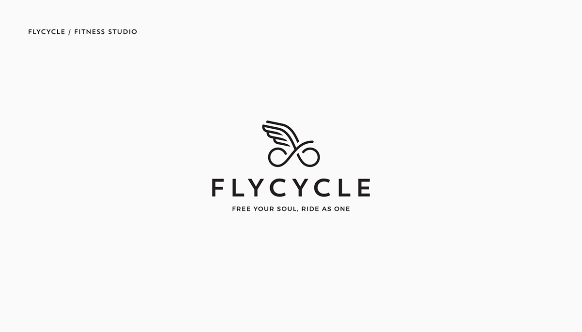
I like how they drew a simple infinity sign with wings to make a bike. The logo really does relate to the name of the company "Flycycle". I like the idea of using an image to capture the importance of the message which is free your soul and ride as one.
Tuesday, March 22, 2016
Stance Poster Project Reflection

Version 1

Final Version
Reflection Questions
Do you believe your stance clear within your poster? Defend your answer- image, fonts, color, composition, etc.
I believe that my stance is clear within my poster. I used images associating with the Nike company and how thousands of factory workers overseas are getting paid much less compare to how much the overall company earns. My stance also isn't only targeting Nike company itself, but it can also relate to the many other large corporations out there that have low wages for their workers. I also believe that the different fonts I used stand out.
From your initial thumbnail sketches to your hand drawn draft- Do you feel you were successful in re-creating your poster idea digitally? If not, do you like the new visual outcome?
I believe from my initial sketch that I did not recreate my poster digitally. I think the new visual looks pretty nice with the different usage of colors compare to my simple sketch with no color and plain font. I also like the positioning of the text compared to the first version.
What were the changes you made from your first version to the last version of the poster? Explain why you made those changes?
As mentioned before, the usage of different fonts on the final version is very much different compare to the first version. The first version only used the simple font on Adobe Illustrator, while the final incorporates a Nike font and merging images with words to create a completely new font. This was so that my text could pop and stand out more. I also switched the position of the texts by making boxes and having Nike as the center. I wanted the audience to focus on Nike as a focal point of my poster. I also made the fonts in a diagonal in the new version so that the words still focus on Nike. I also added a finger and actual check in the poster to clarify the meaning of my message since just a Nike swoosh symbol was unclear in the original version.
Looking over your rubric, which category do you think your project is strongest? Explain why. Which category do you feel the least confident? Explain why.
I feel like my strongest category is concept. I actually like my message "Only Nike gets a check" cause of the double meaning behind it. The company logo is a swoosh and Nike does gain more revenue compare to the total amount of money they pay workers working in factories overseas. My least confident category is probably design. I feel like the background used on the poster could be better. But I really like the idea of using brands that Nike owns like Jordan and Converse. The font of "get" might be hard to read as well which also concerns me.
What was the most challenging aspect of the project, conceptually?
The most challenging part of the project was first think about a stance to do my poster project on. At first, I was confused on what kind of problems could relate from Basketball. I then figured out about factories workers who manufacture Nike shoes have very minimal salary compare the the average revenue that Nike gains each year. I also found out that the situation was worst for Nike back then and that ultimately drove me to choose my concept.
What was most challenging about the project, technically?
Using Adobe Illustrator itself was challenging since I feel like it is much more challenging compare to Photoshop. We spent many lessons learning its functions and the amount of editing options on the system is pretty overwhelming.
Monday, January 11, 2016
What's my stance on Social Media?
Nowadays it is really hard to avoid talk of social media since everyone can have easier ascess to the internet. I personally occasionally would go on Facebook and look at my newsfeed about political issues, sports, friend posts, etc. I never would comment on a Facebook post unless I personally know the person. I usually am the type of person to read comments and observe how people are interacting when it comes to a certain topic and the fact that it is being posted online. What concerns me the most about social media is that over time, people would soon rely on everything that is being posted on Facebook rather than other reliable sources like magazines and newspapers. I feel that the internet will have a greater impact on humanity in the future and kind of scared how people can post anything on social media without others knowing their true identity. That is one of my greatest worries about social media and how sometimes it can lead people in a false direction.
Link on how Facebook changes our lives
http://www.usatoday.com/story/tech/2014/02/02/facebook-turns-10-cultural-impact/5063979/
Another topic that I've read on Facebook was about the terrorist group ISIS. There have been many news about ISIS, especially after the recent terrorist attack on Paris.
http://www.cnn.com/2016/01/12/europe/turkey-istanbul-explosion/
Monday, December 21, 2015
Ball is Life

3. My gif has evolve from its original idea in that during the drafting process, I wanted to just show a sharingan spinning then slowly turn to a basketball. Over time, I added the idea of a smile, to show my emotional change through watching anime and then playing basketball. I had to use the eliptical marque tool to shape the smile and make it a more natural change. I originally was unsure of a background, but eventually added the basketball court. Then, I realized that there was space for my favorite team, the Miami Heat to zoom in and make my day. Making the sharingan and basketball spin was indeed hard since both had to be precisely rotated at the right angle with the right opacity to make the transaction look smooth.
Sunday, November 29, 2015

Sunday, November 22, 2015
Pokeon : Gotta Catch 'em All!
1. My concept behind the portrait transformation is the idea of combining anime and a person. The show I chose to based my image on is Pokemon, one of my favorite childhood cartoon. I wanted to alter the image so that a person could look like a pokemon trainer. As a child, I sometimes wished for Pokemon to be real, and this portrait transformation allowed me to recreate my childhood wishes into a cool image.
3. Overall, I am happy with the results of my transformation. The filter came out really clean and it actually helps depict the background image of a cave since the filter was darker.
5. First for the background, I used the magnetic lasso tool to crop out the original pokemon trainer Red, since I wanted to put Keon in his place. Then, I would used the same tool on Keon and copy and paste Keon in the background as a new layer. I had to adjust the size so that Keon would fit. Then, I used the eraser tool and spot healing tool to make Keon clean and spotless. For the next layer, I added a trainer hat to put on Keon, since the original trainer Red also had a hat. Then I had to make a mask on Keon's layer, because I wanted to erase the phone in his hand. Using the mask, I was able to erase Keon's phone, and added a Pokedex used by Pokemon trainers in his hand. This was also a new layer that was underneath Keon's layer for it to show through the mask. For my final layer, I added pokeballs to each corners of the image(because you gotta catch them all). I used the clone stamp tool on the original Pokeball and cloned 3 additionl Pokeballs in each corner. Finally, I chose a dark filter using the curves in Photoshop because the background was a cave, and thus I wanted the image to be darker. The final end product came out perfect in my opinion.
Finished Project:
Original Photos:


Subscribe to:
Comments (Atom)