
Not the original Nike Logo
1) One of my favorite logo is the Nike Company Swoosh. I've been into Nike ever since I started playing basketball. The way they designed the swoosh is really cool, like the angle on the curve. The logo got its inspiration from the Greek goddess of victory Nike represent one of her wings. Looking at the logo inspires me to work harder to achieve my goals, whether its in sports or anything other accomplishments I strive for.
2)

I really like how the logo is drawn. The idea of a paperclip being transformed into a heart is pretty cool to me. The color of white font and pink background really makes the logo stand out.

I like how they made the lighting bolt an M which stands for Motionvolt. The M also kind of reminds me of the Mcdonold logo and thus sticks to your memory better.

The way they made the letter C look like a camera lens is pretty cool. By making the logo a camera, it really emphsize what the meaning of the logo is about. The logo also reminds me of the popular Instagram app icon which helps people remember the logo better.

I love how the word "on" looks like a key. I thought the idea was pretty neat and funny as well. By captiilizing the letters helps make the words pop and stand out more.
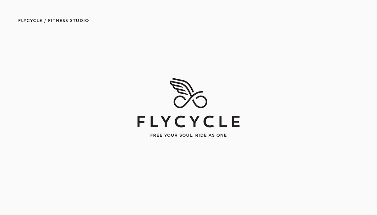
I like how they drew a simple infinity sign with wings to make a bike. The logo really does relate to the name of the company "Flycycle". I like the idea of using an image to capture the importance of the message which is free your soul and ride as one.
No comments:
Post a Comment